WELCOME TO THE PIZZA PARTNER CLUB
Lets get you caught up.

WE’RE RISING TO NEW HEIGHTS.
Our brand takes advantage of visual elements to take our Pizza Partners further. Our badge ecosystem is specially designed for our Pizza Partners to visually convey their pledge.
Including this badge in your brands communication places you amongst a thriving community of pizza industry leaders. More importantly, it helps customers understand your brand values better and connect with them more deeply.
OUR BRAND AND YOURS
Getting Started
Read below to gather inspiration, view placement guidelines, and download the necessary files for our badges across your pizzeria's needs. Explore how to implement our brand elements alongside your brand identity for a seamless and cohesive look that resonates with your customers.


Digital Content
Marketing

GO FURTHER WITH YOUR PIZZA PARTNER TOOLKIT.
Get the most out of your badge system by following our placement guidelines below.
Placement
Our Pizza Partners get access to a toolkit that helps communicate your brand pledge. By following these guidelines, we can effectively maximize the visibility and impact within your pizzeria, attracting the attention of customers and increasing brand awareness.
The following are provided in our Pizza Partner toolkit to active Pizza Partners. To submit a request for additional elements reach out to us here.


Sticker 53mm x 73mm
Clean surface, peel sticker, align and press with squeegee to remove bubbles, let adhesive set.
Decal 95mm x 200 mm
Prepare glass by cleaning with glass cleaner and cloth. Position decal, press from center outward, remove tape, let decal cure.
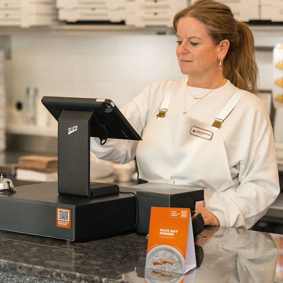
Counter Top Sign 4in x 6 in
Fold the sign along the designated crease to allow it to stand independently. Place upright on counter for maximum visibility.
It's crucial to strategically place our decals across various key locations to maximize visibility. Here are the guidelines for decal placement. Reference below to explore placement ideas and inspiration across your pizzeria.
Decal Placement
Place the decal at eye level (approximately 54” from the ground") near the entrance door, or within line of site onto pizza case ensuring it's highly visible to customers as they enter the pizzeria.Orient the decal horizontally. Avoid obstructing any crucial signage or architectural features, or major reflective glares.


Front Door
Window Front
Order Counter
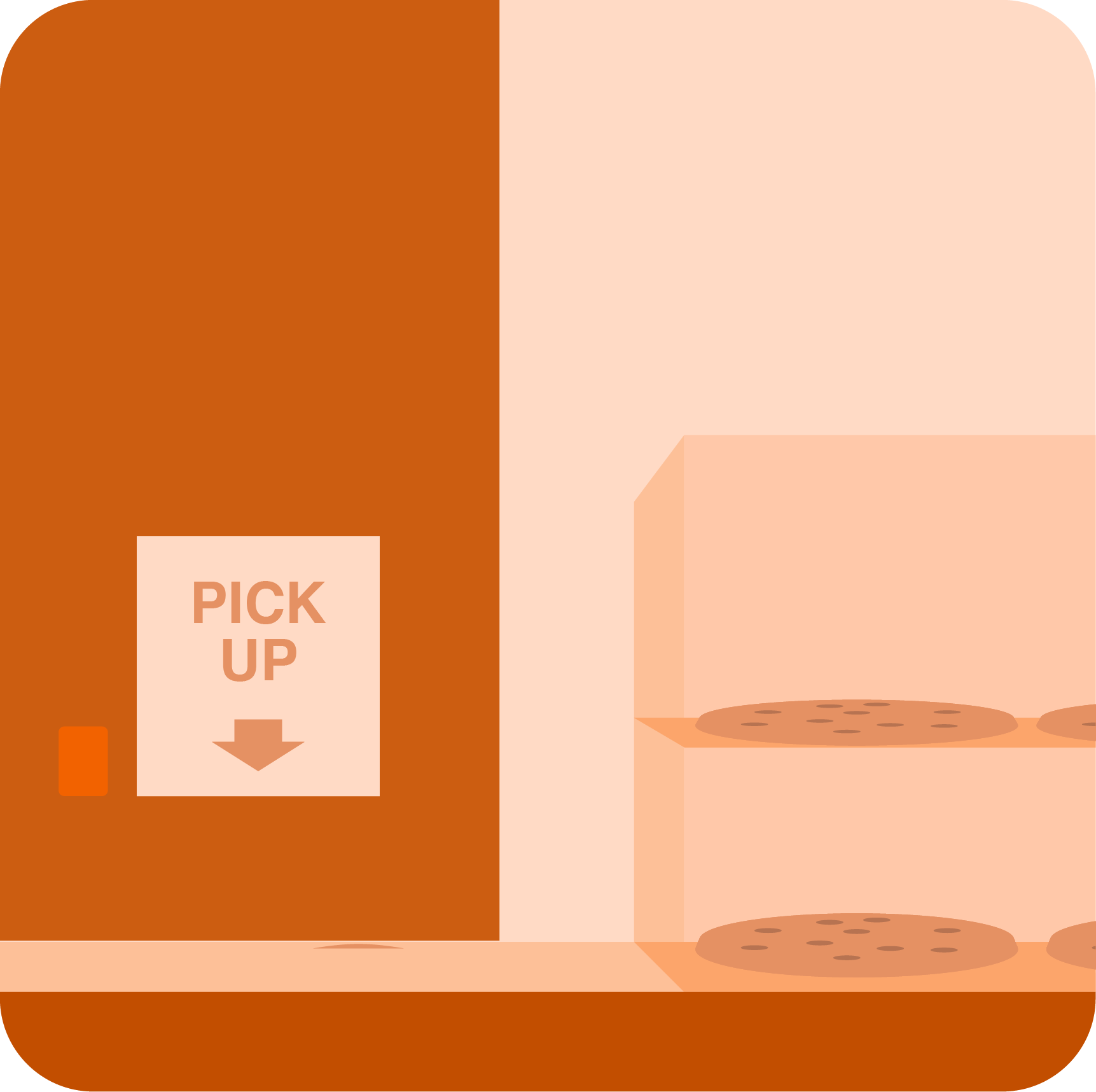
Pick Up Area
Sticker Placement
Position the sticker near the order counter, ideally at eye level or slightly above to catch the attention of people waiting in line. Place the sticker on the counter surface or on a nearby vertical surface, ensuring it's visible to customers during the ordering process. Avoid obstructing the view of menu boards or order displays.


Register Terminal
Mirror

Mobile Truck Order Window
Order Counter Sticker
Counter Top Sign
Position sign near the order counter, ideally at eye level or slightly above to catch the attention of people waiting in line. Place the sign on surface offering the most visiblity to customers. Avoid obstructing the view of menu boards or order displays. Avoid placing in areas prone to congestion or where it may be easily overlooked.


Order Counter
Pick Up Area


Waiting Area
High Visibility Counter


DOWNLOAD DIGITAL CONTENT
Logo


White Dough
For layouts with few colors or when the main colors are not clear against the background, use only on dark backgrounds.
Black O-love
Use this badge on layouts with minimal color or when the main color logo is not clear against the background. Ideal for light-colored backgrounds where Joy-rnage does not fit style.
Joy-range
Use on light or dark backgrounds with sufficient contrast for legibility.
Badge


Joy-range
Use on light or dark backgrounds with sufficient contrast for legibility.
Black O-love
Use this badge on layouts with minimal color or when the main color logo is not clear against the background. Ideal for light-colored backgrounds where Joy-rnage does not fit style.

White Dough
For layouts with few colors or when the main colors are not clear against the background, use only on dark backgrounds.
HOW TO USE
Digital and Print Guidelines
If you create marketing material for the web or onscreen communications, use the high-resolution scalable artwork in SVG format. For printed material, use the logo artwork in PNG format that matches the color profile of your print production mechanical.


Badge
Best suited for: digital application, small scale communication, alongside other companies badges, imagery.
Logo
Best suited for: print marketing, large scale communication, solid colored backgrounds.
Select one artwork only, not a combination of logo and badge.
Ensure that the main message or graphic is the focal point. Place the art work under or beside the content. Keep smaller than other images and messages. If using badges alongside other food service logos, place the appropriate badge first. Joy-range color is recommended, but choose the color scheme that fits your design best.
Sizing
The Pizza Partner logo is a combination of the Slice Out Hunger logo with the Pizza Partner message set in specially designed type. This logo can be used in all marketing communications promoting your pizzeria. If badges from other services appear on your communication, do not use a logo. Instead, use the Slice Out Hunger badge.
The logo is designed for versatility and can be used on layouts where the Slice Out Hunger badge is either crowded by limited layout space or appears visually heavy in the layout. Our logo is especially suited to banner ads, print ads, and other forms of advertising.
Badge Sizing Framework
Badge
72px, 1 inch width

Quarter
24mm

To increase legibility do not size the badge below 72 points or inch in dimensions. That is approximately the size of one quarter dollar for reference.
Logo Sizing Framework
Logo
50px, 0.7 inch width

Dime
0.7 inches

The Pizza Partner logo allows more flexibilty in sizing. When considering placement do not size below 50 points or 0.7 width. That is approximately the size of a US dime.
Improper Use
The Slice Out Hunger logo is your pizzerias promise to pledge to fight hunger. Use only the logo artwork provided by Slice Out Hunger. Do not change the Slice Out Hunger-provided artwork in any way. Never build your own Slice Out Hunger logo. Do not revise the text in any way shape or form.


Do not eliminate or modify elements of badge.


Do not replace the color music notes icon with the Apple logo.


Do not use on top imagery with insufficient legibility.


Do not modify, angle, animate, rotate, or tilt the badge.


Do not reshape or place badge in another container.


Do not use emblems icons, logos, or graphics from the Slice Out Hunger site.


Do not apply special effects such as shadows or glows to the badge.
Unboxing Contest!!
Unboxing Contest!!
We’ll be shipping out or next round of new Pizza Partner kits on April 21st and hosting an unboxing contest for anyone who:
Receives a Pizza Partner kit
Posts an unboxing video & tags us @sliceouthungeron social
Receives the most likes
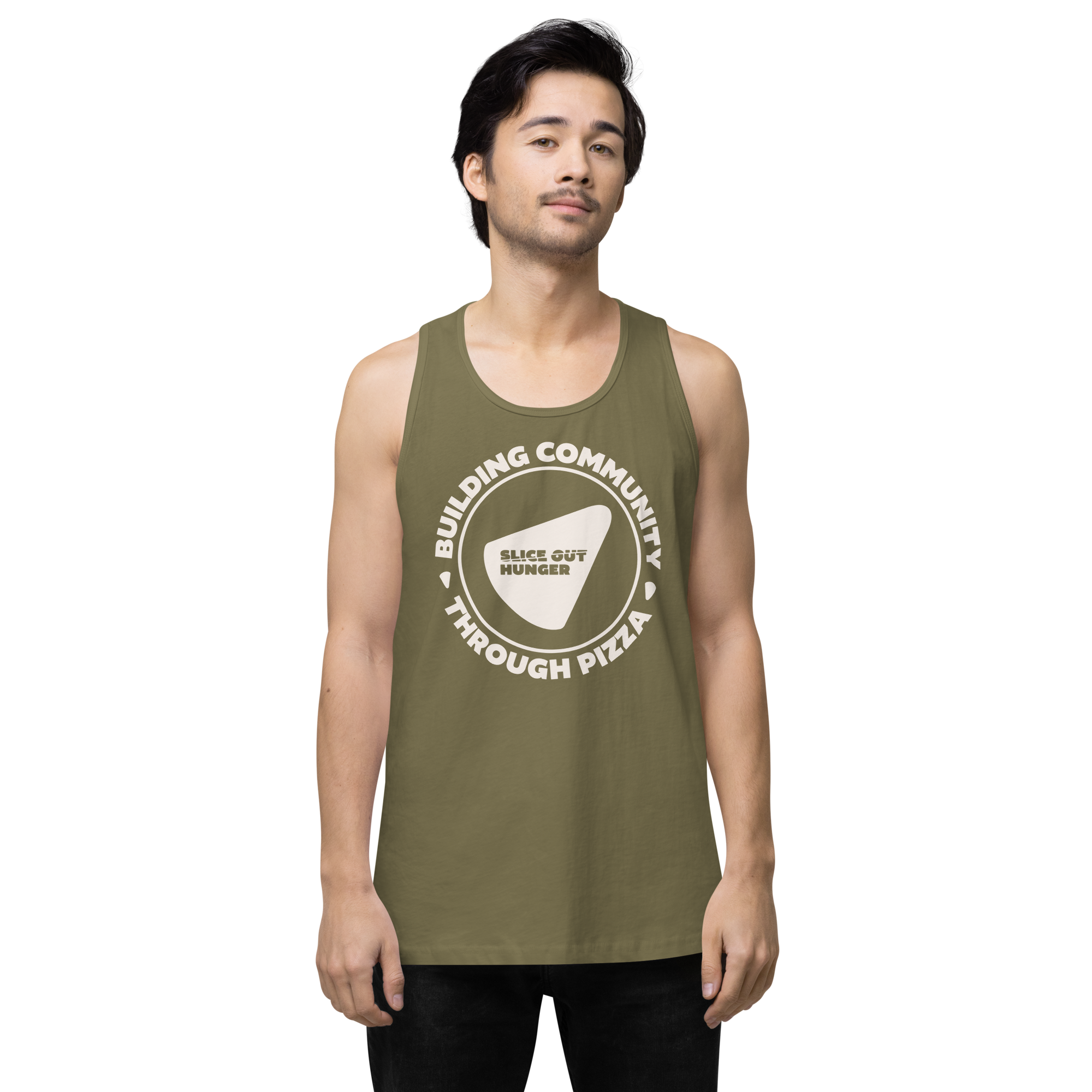
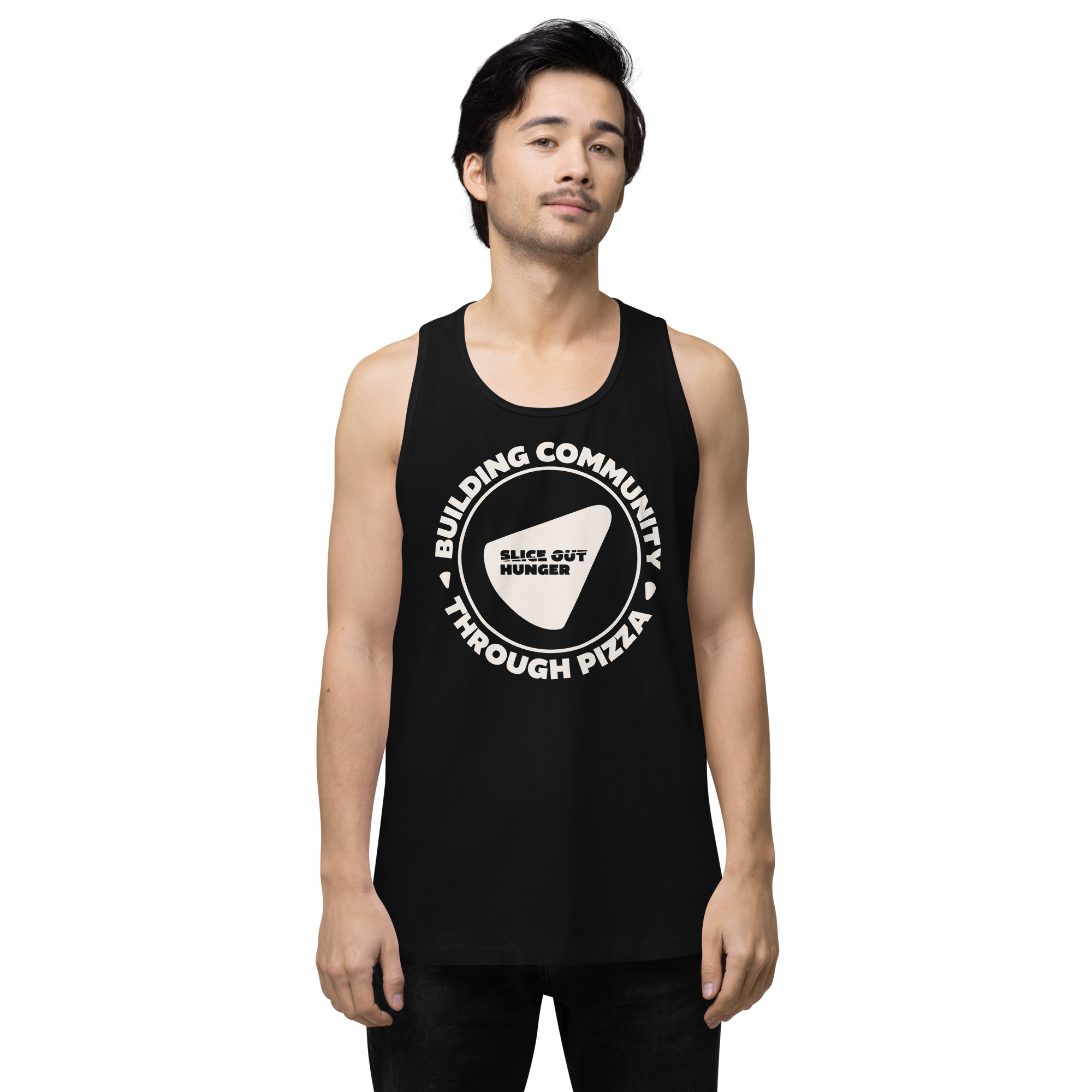
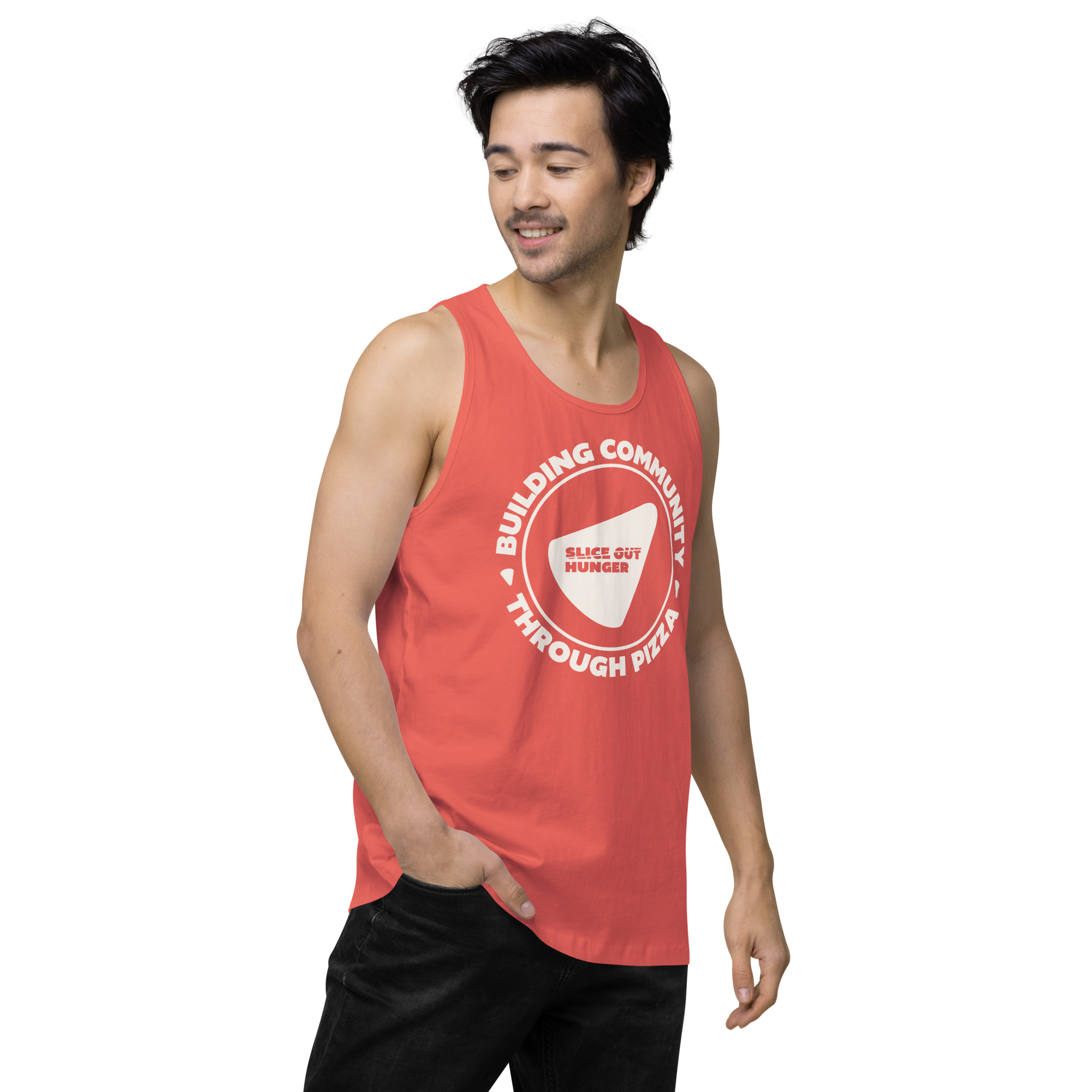
Contest deadline is Friday, May 15th!The winner will receive a Slice Out Hunger Building Community tank!
NEED MORE SLICE OUT HUNGER GEAR?
If you received a Pizza Partner kit prior to our rebrand OR want some more swag for around the shop, you can order everything included in the current kit below. You can even find a few extra goodies on our Pizza Partner Shop page. Everything is priced with no mark-up.


