Brand Partner Resource Page
This hub is your one-stop destination for unlocking the full potential of our partnership.
Download our full brand file, or access individual elements below.

We’re thrilled to have you here.
Think of this page as your launchpad to promote Slice Out Hunger across all your channels to connect you to a wider audience and form new connections within our pizza community.

Our Brand
Marketing & Advertising Communication Guidance
Transparancy in communication is critical in the way we communicate with our audiences. Learn more about our transparency in reporting here.
Any merchant marketing materials that mention Slice Out Hunger should:
Aim to be clear, honest, and helpful
Present accurate information about contributions, ensuring transparency for customers
Follow Slice Out Hunger’s brand guidelines provided below
Use language that customers easily understand, avoiding confusion or misunderstanding
Be welcoming, friendly, and approachable in tone, reflecting Slice Out Hunger's commitment to customer satisfaction.
When communicating with customers about Slice Out Hunger, please ensure:
Customers are given the opportunity to opt-in or provide consent for communication
It’s easy for customers to unsubscribe or opt out if they wish
Email-harvesting practices are not used to reach potential customers.

Download
You can access all of the information included on this page in our downloadable brand guidelines. The file also includes information on our:
Mission & purpose
Voice, tone, & values
Audiences
Type hierarchy & fonts
Branding & Style Guide
Brand Assets
Your brand should always take visual lead in marketing for all the elements below when featuring the Slice Out Hunger logo.
On darker backgrounds use White Dough logo, for lighter backgrounds use Black O-love logo. Joy-range should only be used as a background color for co-marketing material.
Reference our color palette below for a full digital color recipe.
Wordmark


White Dough
Black O-love
Joy-range
Emblem


White Dough
Black O-love
Joy-range

Sizing and Use
Sizing & Spacing Principles
To ensure legibility of Slice Out Hunger branding, never use our logo or emblem smaller than the minimum size requirements.
Minimum Sizing


Screen 40 px / 53 pts
Print 14 mm / 0.16 in
Screen 15 px / 20 pts
Print 5.1 mm / 0.2 in
Clearance
Slice Our Hunger branding must be presented in a clear and uncluttered space free from text and other graphics. Surround both the logo and the emblem with one width and height of our ‘S’ emblem.


Improper Use
Your brand should always take visual lead in marketing for all the elements below when featuring the Slice Out Hunger logo. The following guidelines apply to all wordmark, emblems, and icons related to the Slice Out Hunger brand.
Reference our color palette below for a full digital color recipe.


Alterations
Do not alter our logo in any way,
Color
Do not recolor our logo outside of the provided assets


Distortion
Do not warp, distort, or transform logo
In-line Text
Do not use our logo with in-line text. Spell out in message consistent type.


Stylized edits
Do not apply any stylized edits, shadows, or blend modes.
Sizing
Do not use logo in small scale. Refer to sizing guidance for alternative options.

Color
Spreading Joy
Our color scheme is central to our brand. Use the screen colors listed below for all digital uses.
We don’t see things in black and white. Let our colors Black O-love and White-Dough lead all digital applications with a warmer tone. For print, standard black and white is fine.
Joy-range
HEX F26200
RGB 242.98.0
HSB 24.100.0
CMYK 0.80.100.0
Black O-love
HEX 282420
RGB 40.36.32
HSB 29.20.15
CMYK 66.65.68.72
White Dough
HEX F9F1EA
RGB 249.241.234
HSB 26.05.97
CMYK 01.05.07.0
Accessibility
We have undergone a high level of color engineering to make our color palette accessible to everyone. Our secondary palette builds upon our primary palette to meet ‘AA’ accessibility design guidelines. Reference color alternatives in the presence of conflicting contrast.
J-4
HEX C24E00
RGB 194.78.0
HSB 24.100.76
CMYK 15.85.100.6
Joyrange
HEX F4873D
RGB 244.135.61
HSB 24.74.95
CMYK 0.62.92.0
J-1
HEX FDC098
RGB 253.192.152
HSB 22.39.99
CMYK 0.32.42.0
B-O-2
HEX 1C1917
RGB 28.25.23
HSB 22.17.10
CMYK 69.67.67.79
Black O-love
HEX 282420
RGB 40.36.32
HSB 29.20.15
CMYK 66.65.68.72
B-O-1
HEX 49443F
RGB 73.68.63
HSB 29.13.28
CMYK 62.60.64.46
W-D-2
HEX CEC8C4
RGB 206.200.196
HSB 02.04.80
CMYK 18.18.19
White Dough
HEX F9F1EA
RGB 249.241.234
HSB 26.05.97
CMYK 01.05.07.0
W-D-1
HEX FCF7F5
RGB 252.247.245
HSB 16.02.98
CMYK 0.03.02.0
O-G-2
HEX F26200
RGB 242.98.0
HSB 24.1OO.94
CMYK 0.80.100.0
Ore-Green-o
HEX 696936
RGB 105.105.54
HSB 59.48.41
CMYK 56.44.97.27
M-Y-2
HEX F2A72F
RGB 242.167.47
HSB 36.80.94
CMYK 2.42.100.0
Mello-Yello
HEX FFC257
RGB 255.194.87
HSB 38.65.100
CMYK 0.30.82.0
M-Y-1
HEX F9CB82
RGB 249.203.130
HSB 36.47.97
CMYK 01.24.61.0
NOTE Mello-Yello takes visual lead on all Summer Slice-a-thon related campaigns.
J-2
HEX FCA56B
RGB 252.165.107
HSB 22.57.98
CMYK 0.47.66.0
J-3
HEX FCA56B
RGB 252.165.107
HSB 22.57.98
CMYK 0.47.66.0
NOTE Ore-green-o takes visual lead on all Pizza Relief related campaigns.
O-G-1
HEX 8C8A49
RGB 140.138.73
HSB 57.47.54
CMYK 47.35.91.11
Our Color Palette

Icons
Simple in shape and versatile in use, our Slice icon underwent a high level of design precision to build our brand and inspire our brand family. Familiarize yourself with our campaigns and access campaign specific brand elements below.
Reference ‘Wordmark and Emblem’ guidelines for proper and improper usage.
Our Icon

Icons play a ‘small’ yet mighty role in our communication. Pizza is at the core of Slice Out Hunger, making it extra critical to create a design system that is playful, versatile, and entirely pizza. The result is a highly engineered yet incredibly simple pizza icon to capture the essence of joy and inclusivity associated with pizza and Slice Out Hunger. They are an immediate visual indicator in a fast-paced and highly evolving landscape. This visual language makes our mission easier to understand while conveying the vast array of support Slice Out Hunger provides.
Pie it Forward


Pizza Across America
Las Vegas Pizza Tailgate


Pizza on the Pier
Summer Slice-a-thon

Dollar Pizza Party
Season of Giving


Pizza Relief

Photography and Videography
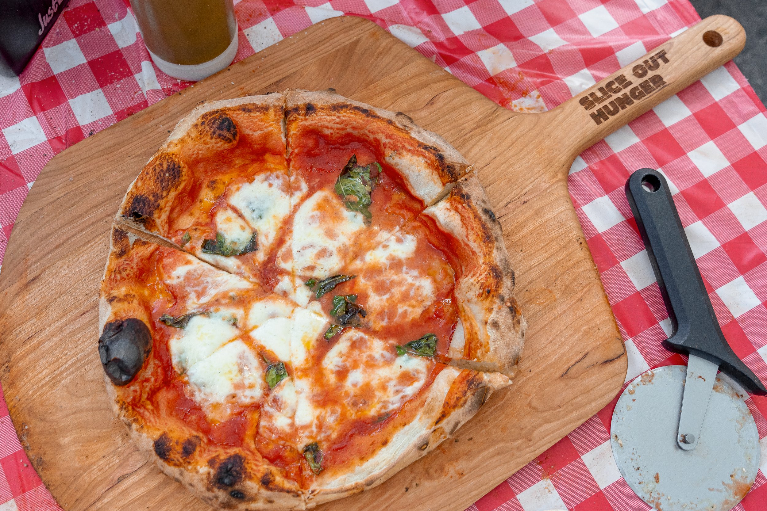
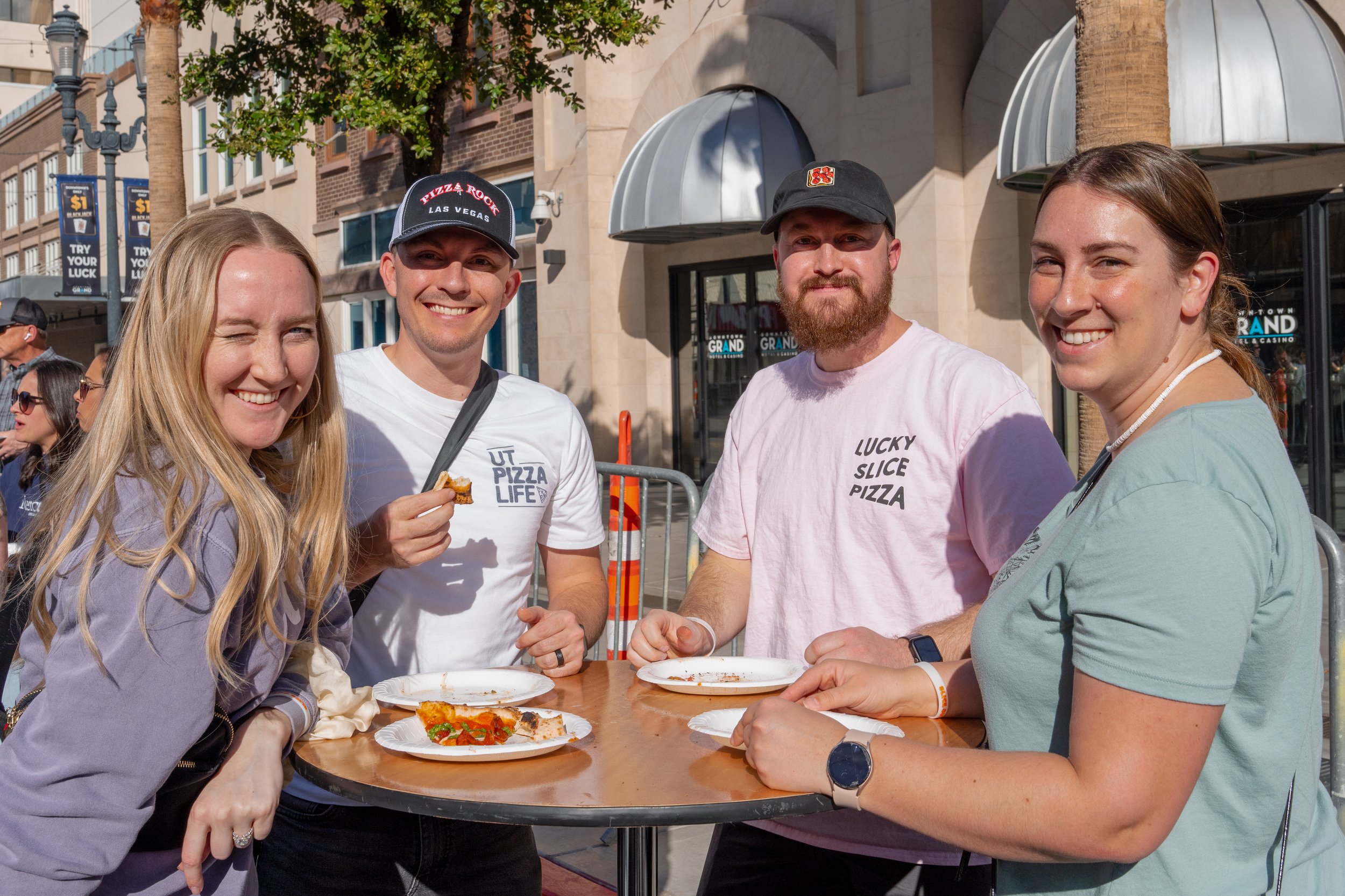
Our photos, like our brand, should be warm, vibrant, and bright. Visually communicating in this style will reinforce our brand message, personality, and tone– creating a strong brand presence. Reference the photos provided as a visual indicator of stylistic edits.
Styling
Our photography should refrain from any stylized shots and heavy filters. We prioritize keeping people, connections and our brand central through using natural colors, balanced lighting, and contrast, paying extra close attention to the message told through the lens.
WARM, VIBRANT, AND BRIGHT.


Our Recipe Card
Location Campaign specified venue (pizzeria, park, etc.)
Action Pizza centered, community, moments of joy
Angle Forward, Subject focused
Edit Natural, non-stylized, warm
Lighting Natural, contrast-balanced
While appropriate in subject matter these photos fail to communicate our message in a brand approved manner. Explore more about how these stylized shots below.
Improper Edits


Why?
Detail heavy. Poor subject attention. Unclear message. Back lit.
Why?
Over saturated. Too high contrast. Over exposed whites.


Why?
Too dark. Poor composition. High contrast.
Why?
Poor resolution. Color tone imbalanced. Poor composition. Backlit causing deep blacks.
Our Latest Photo Assets
FIGHTING HUNGER IS EASIER TWOGETHER
Not a brand partner yet?
Sign up today to become partners in crime.


